Avalonia - Stylizing a templated control with different check and unchecked styles
In Avalonia there is the concept of templated control, which allows you to create your own components, overwrite existing ones and several other things. Normally you overwrite your component's template, via view or code behind and style whatever you need (inserting components, creating another according to some state, etc.).
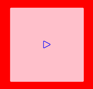
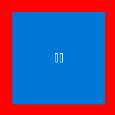
The example below shows how we can create a toggle button with different icons and colors according to its state (checked and unchecked).
For this, some styled properties were created that are called in the component view to insert the data where needed. Normally, a TemplateBinding is used to make the bindings in a templated control, but as we are trying to set the values outside the main component, avalonia cannot find the data and generates a conversion error or a warning that the property does not exist.
To solve this we can use RelativeSource and do something similar to what happens in WPF or we can use the Avalonia style that uses the $parent tag or some others to access the hierarchical levels of the logical component tree.
Here is the example code:
View
    <Style Selector="controls|MyToggleButton > ToggleButton#PART_ToggleParent">
        <Style Selector="^:unchecked">
            <Setter Property="Content">
                <Setter.Value>
                    <Template>
                        <PathIcon Data="{Binding UncheckedIcon, RelativeSource={RelativeSource AncestorType=controls:MyToggleButton}}" Foreground="{Binding CheckedColor, RelativeSource={RelativeSource AncestorType=controls:MyToggleButton}}" />
                    </Template>
                </Setter.Value>
            </Setter>
        </Style>
        <Style Selector="^:checked">
            <Setter Property="Content">
                <Setter.Value>
                    <Template>
                        <PathIcon Data="{Binding $parent[controls:MyToggleButton].CheckedIcon}" />
                    </Template>
                </Setter.Value>
            </Setter>
        </Style>
    </Style>

    <Style Selector="controls|MyToggleButton">
        <Setter Property="Template">
            <ControlTemplate>
                <ToggleButton
                    Name="PART_ToggleParent"
                    HorizontalAlignment="Stretch"
                    VerticalAlignment="Stretch"
                    Background="Pink" />
            </ControlTemplate>
        </Setter>
    </Style>
Code behind
public static readonly StyledProperty<Geometry> UncheckedIconProperty =
    AvaloniaProperty.Register<MyToggleButton, Geometry>(nameof(UncheckedIcon));
public Geometry UncheckedIcon
{
    get => this.GetValue(UncheckedIconProperty);
    set => SetValue(UncheckedIconProperty, value);
}

public static readonly StyledProperty<Geometry> CheckedIconProperty =
    AvaloniaProperty.Register<MyToggleButton, Geometry>(nameof(CheckedIcon));
public Geometry CheckedIcon
{
    get => this.GetValue(CheckedIconProperty);
    set => SetValue(CheckedIconProperty, value);
}

public static readonly StyledProperty<IBrush> CheckedColorProperty =
    AvaloniaProperty.Register<MyToggleButton, IBrush>(nameof(CheckedColor));
public IBrush CheckedColor
{
    get => this.GetValue(CheckedColorProperty);
    set => SetValue(CheckedColorProperty, value);
}
Example of use
<Panel Background="Red">
    <styledc:MyToggleButton
        Width="200"
        Height="200"
        HorizontalAlignment="Center"
        VerticalAlignment="Center"
        CheckedColor="Blue"
        CheckedIcon="{StaticResource pause_regular}"
        UncheckedIcon="{StaticResource play_regular}" />
</Panel>
Result